Labour of Love | Redstone Lake Home: Part 5
KITCHEN
This is by far my favourite design that I’ve done to date, and that I lovingly refer to as my masterpiece. With countertops as far as the eye can see, storage space for days, and all those modern city comforts, there is no room for improvement with this gorgeous kitchen. The original kitchen was pretty lackluster, but now this kitchen is a complete showstopper.
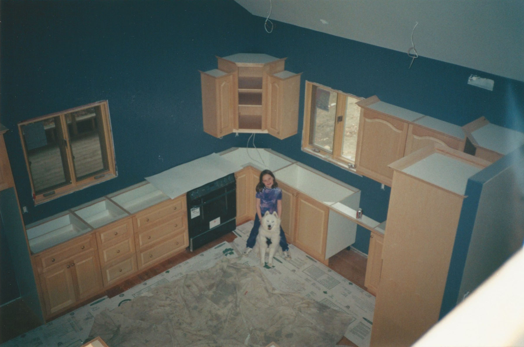
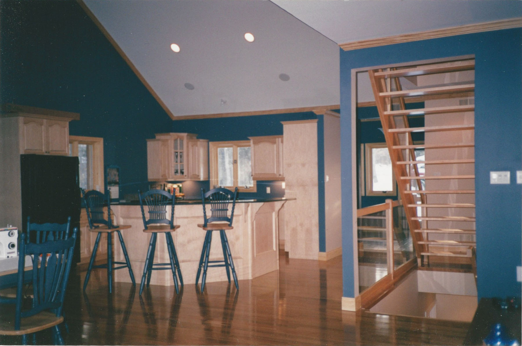
There wasn’t anything wrong with the original kitchen per se; it was just starting to show its 13-year age with its black appliances, 45 degree angled island, and pine coloured cabinetry. But other than its appearance, there were some other issues with this design of the kitchen. First, there wasn’t enough storage, which meant that the island was almost always covered in clutter making it not usable workspace in that kitchen. Next up were the appliances, which were the real catalyst for convincing my dad it was time for a new kitchen. The dishwasher was loud enough to wake the dead, and the fridge wasn’t counter depth so it jutted out from the cabinetry significantly.

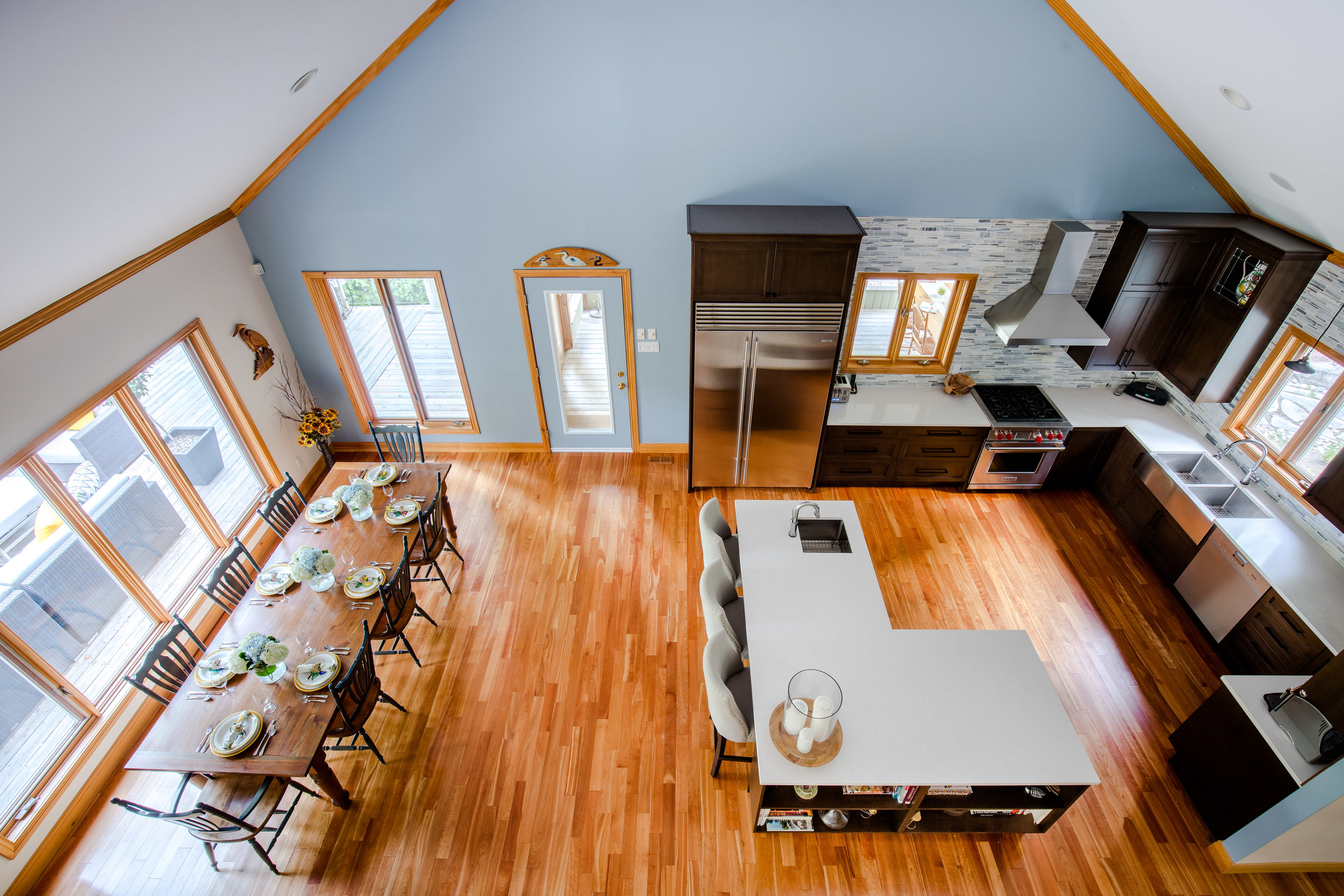
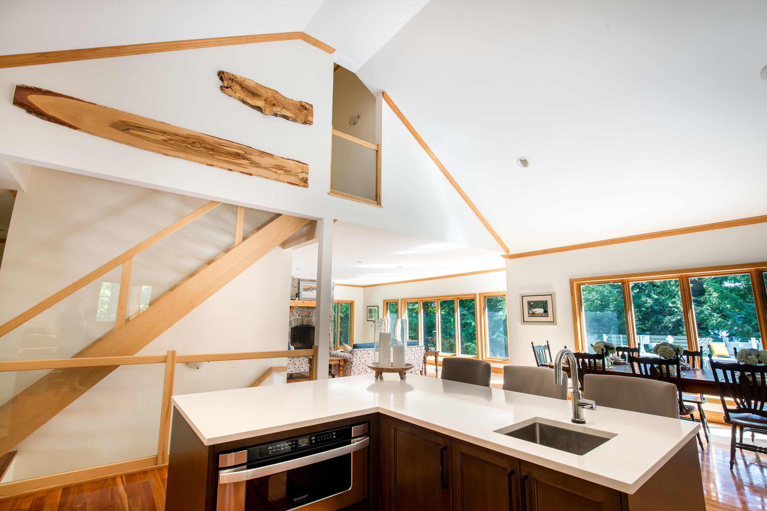
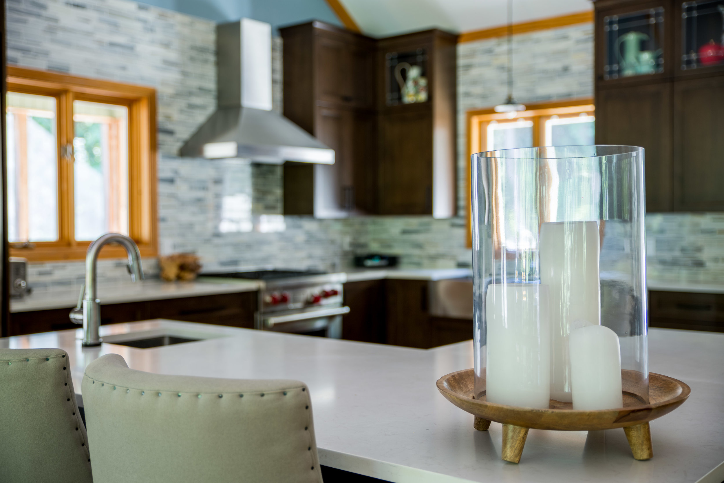
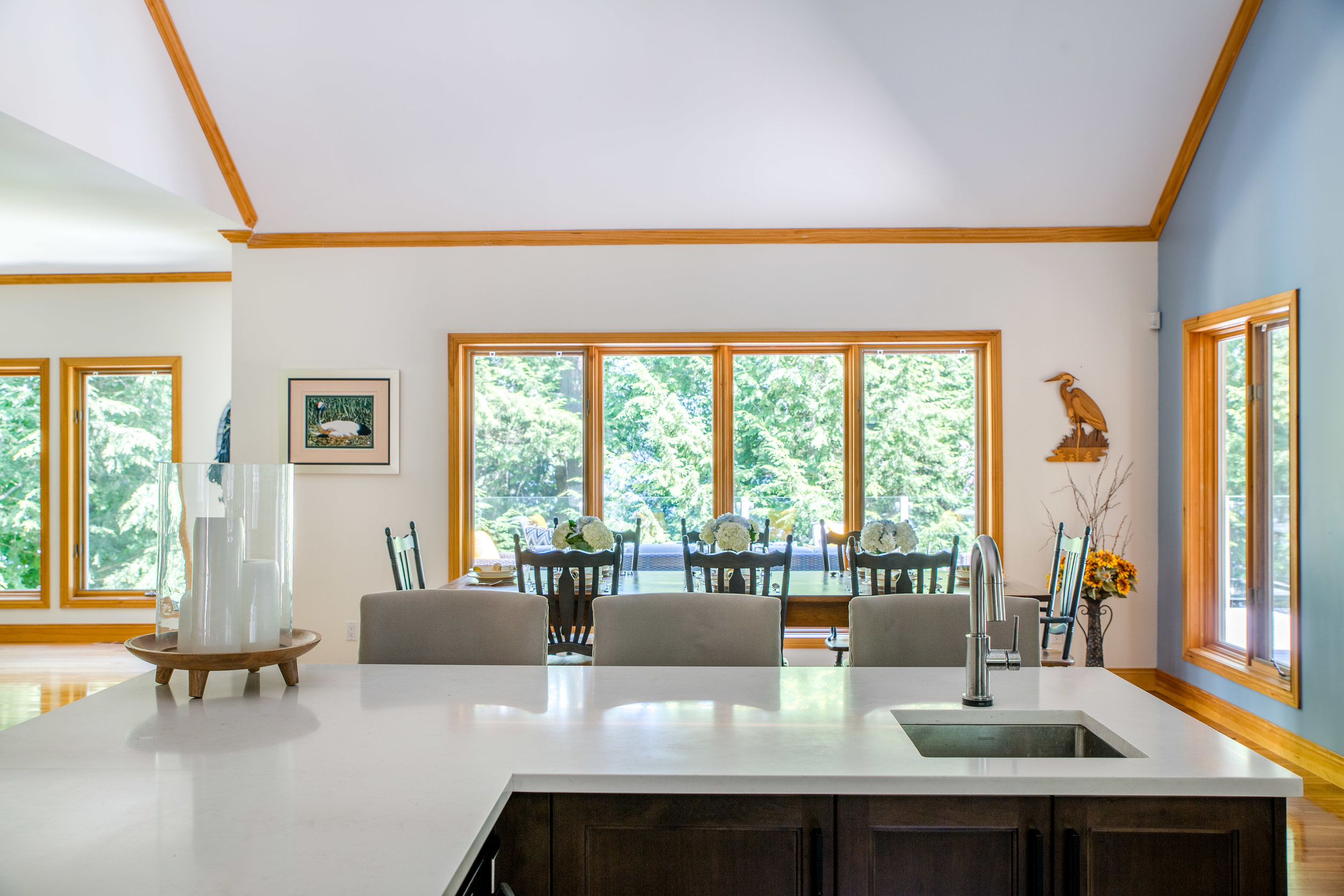
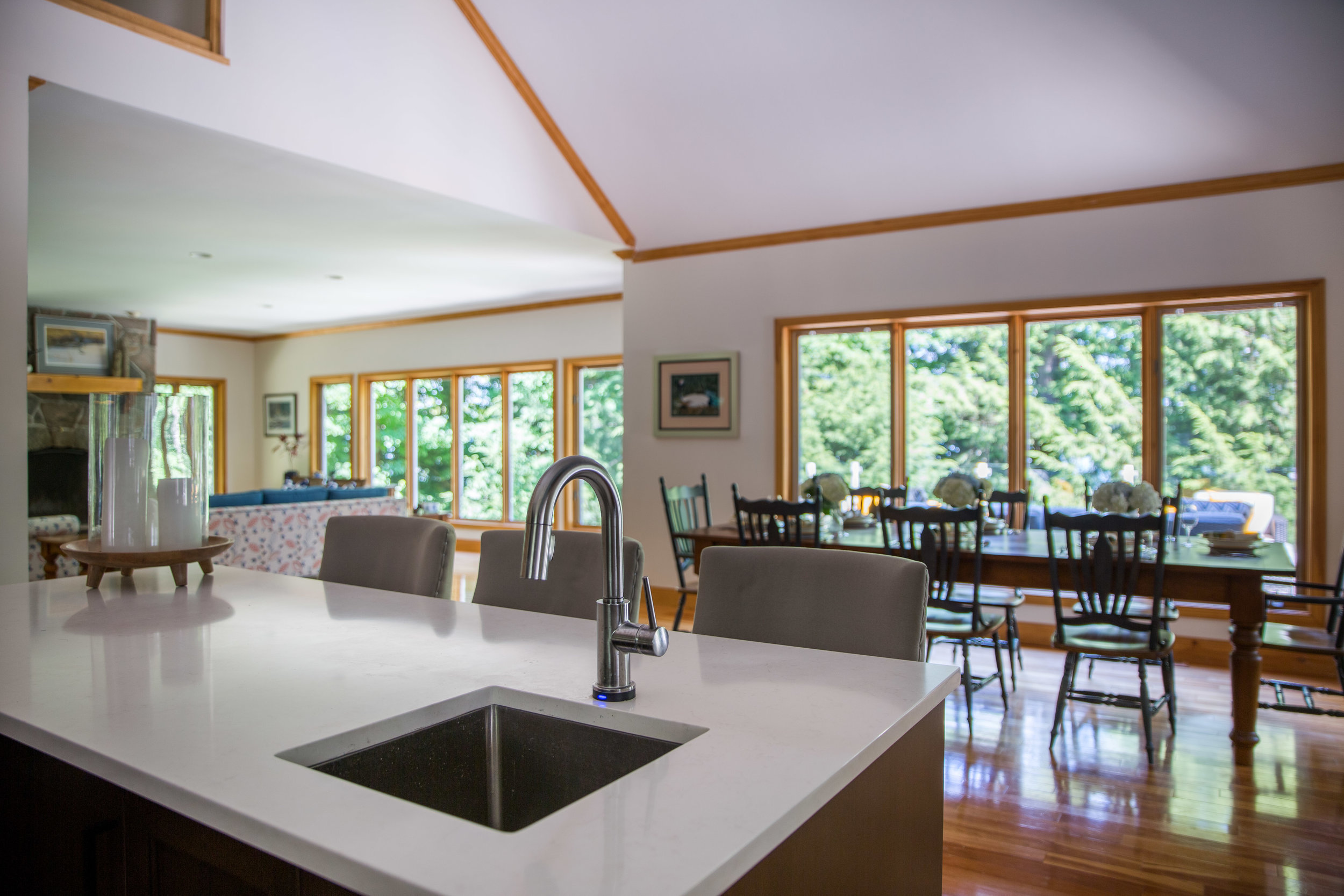
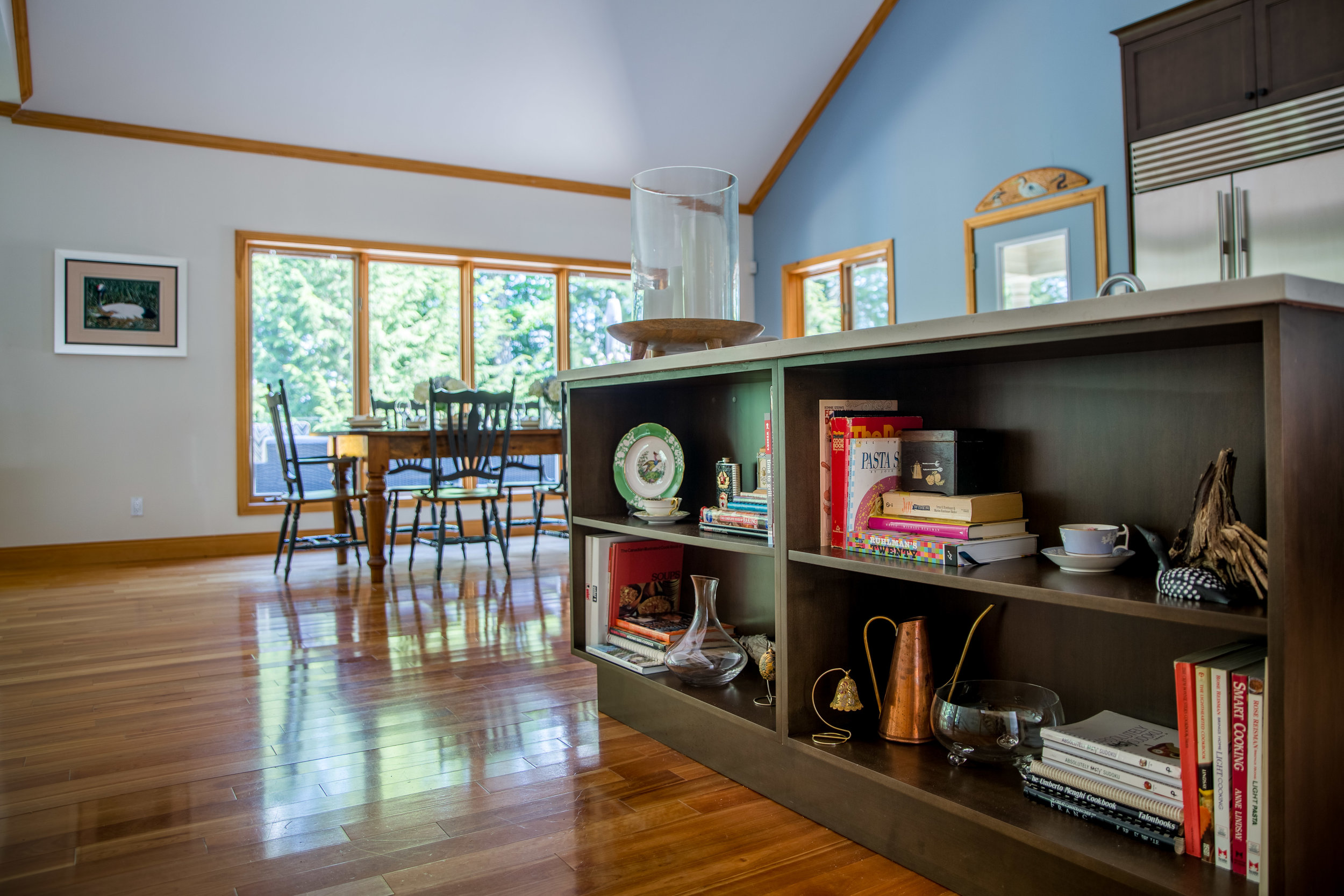
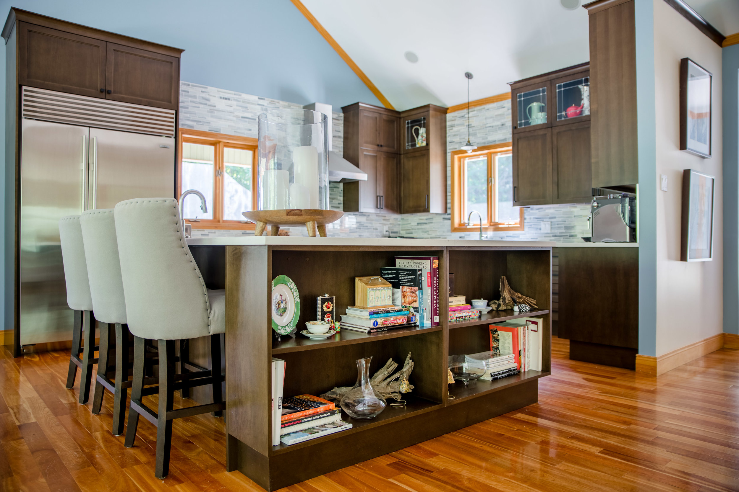
One of the challenges with this kitchen design was the floor. Since the natural wood floor had been exposed to sunlight for 13 years, it had obviously changed colour. This meant that if we drastically reconfigured the kitchen and exposed fresh wood flooring, it would be quite noticeably different. Because of that we kept the same basic layout for the kitchen, but made a couple of simple adjustments to the design of the island that have drastically improved the functionality of the kitchen. The first was the overall shape of the island to the L-shape. By creating the simple shape, it allowed for additional storage along the side of the island on the outside of the kitchen in the form of open shelves. Great spaces for storing all those cook books and small accessories that really make the house feel like a home. The next was to make it all at counter height. By removing the increase to bar height around the outer edge, it means there is even more work surface and there isn’t a hidden area of counter to collect clutter. Another change was to bring the sides of the cabinetry all the way to the floor and the edge of the counter overhang. This allows for the stools to be tucked under completely for a very clean and tidy finish. The last change, and one of the biggest improvements to the island, was to add a second sink. I chose to go with something a little larger than a typical bar sink so that two people can be prepping food for dinner at the same time.
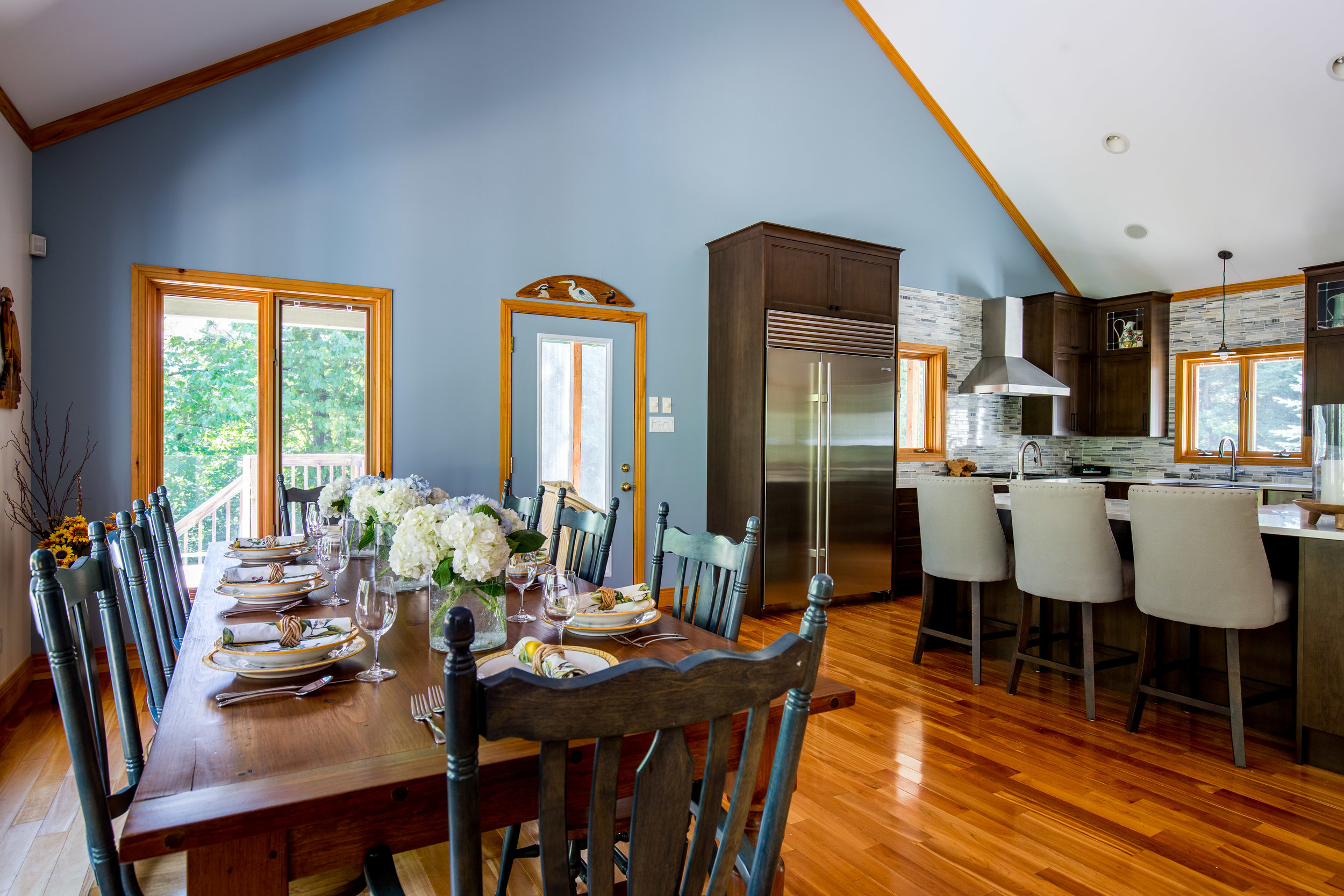
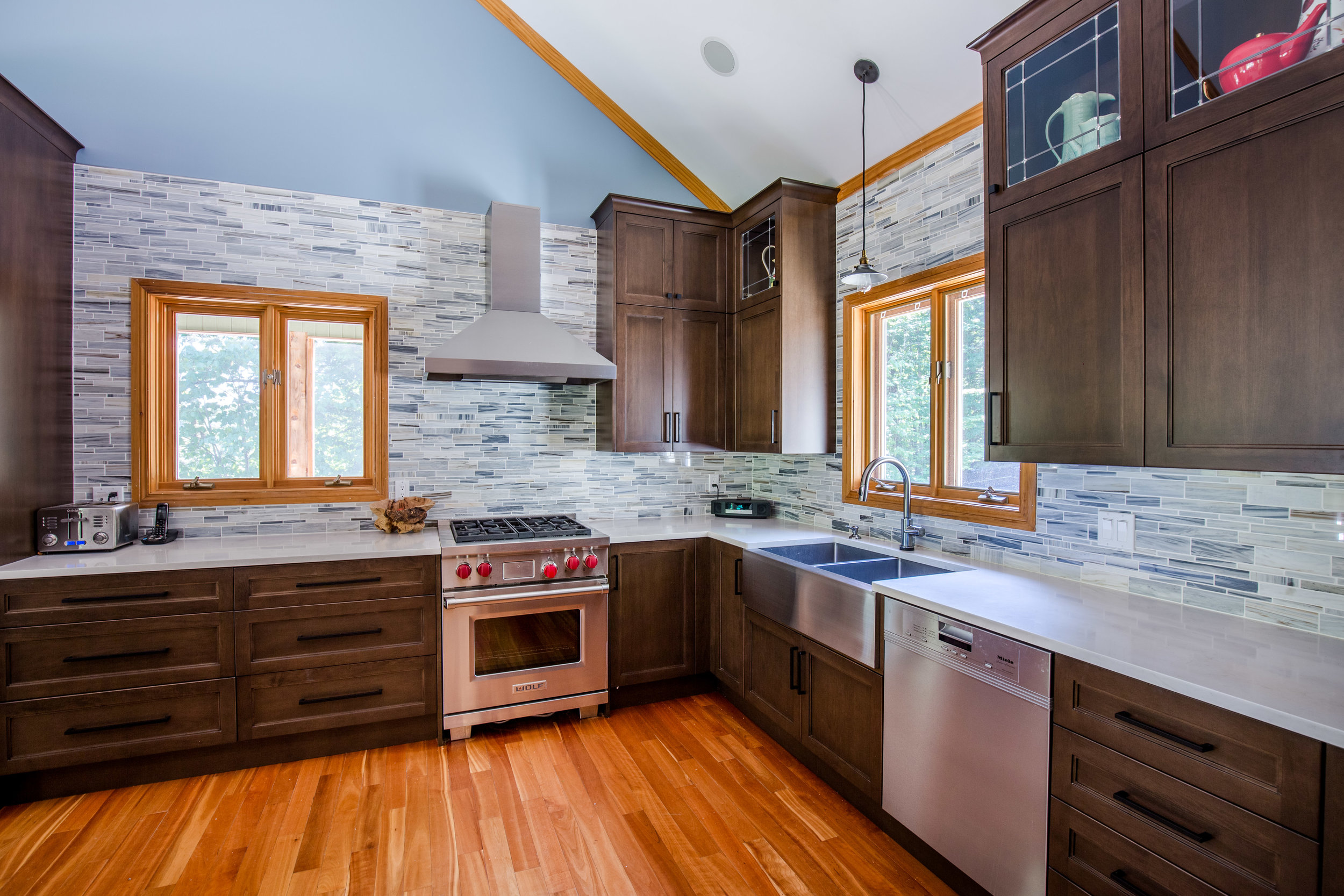
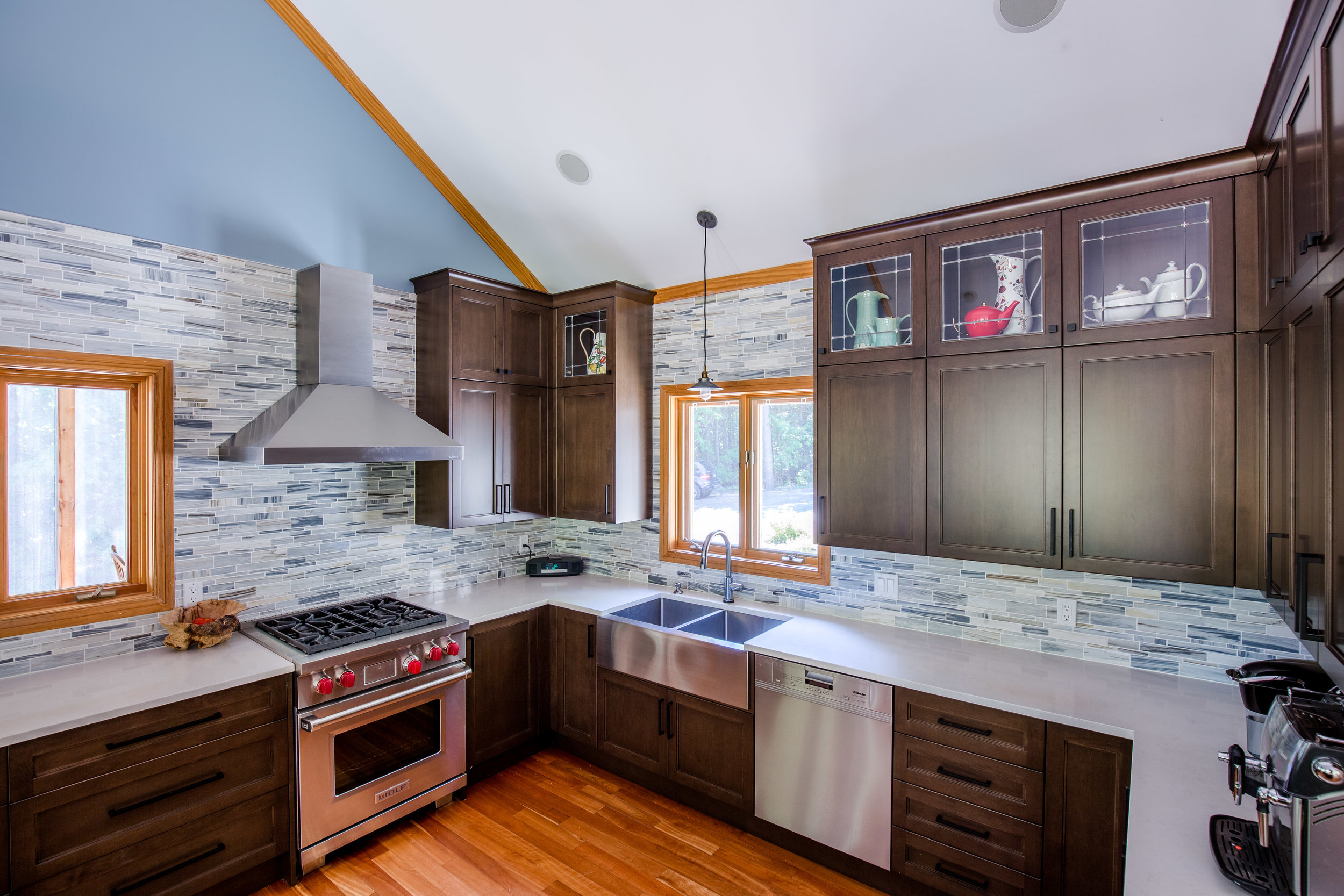
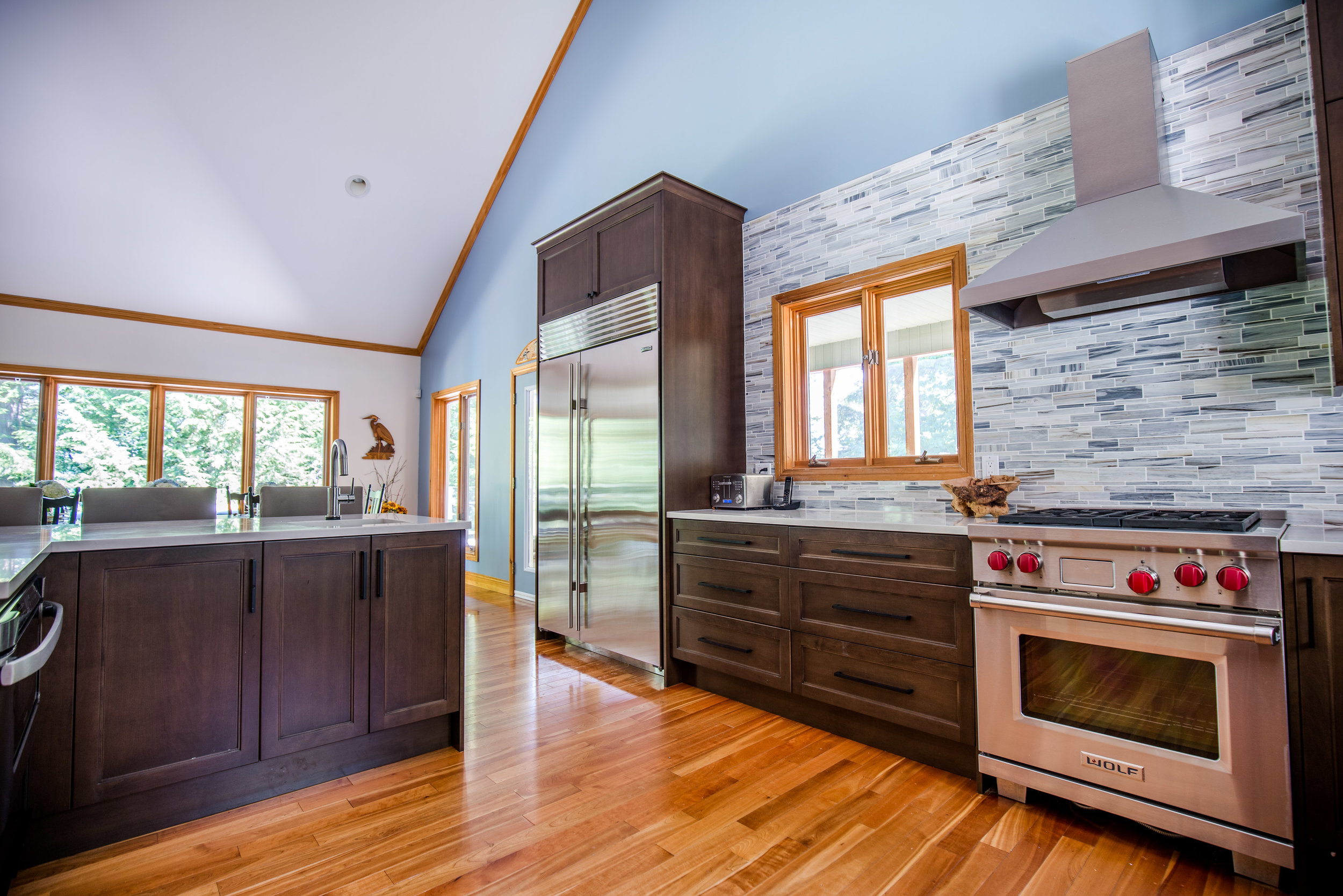
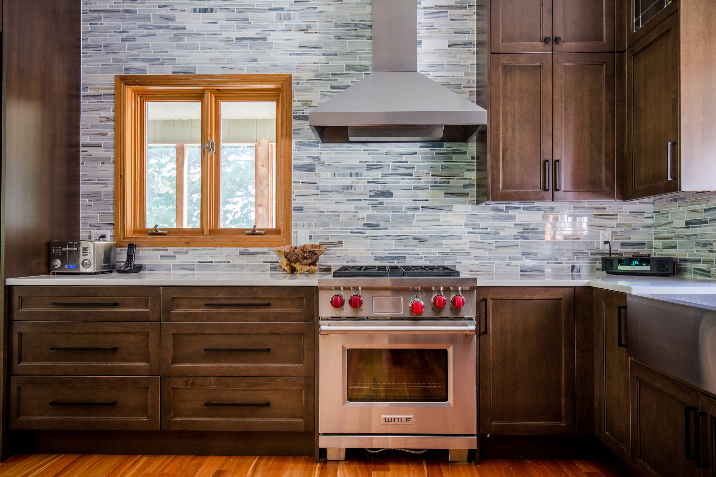
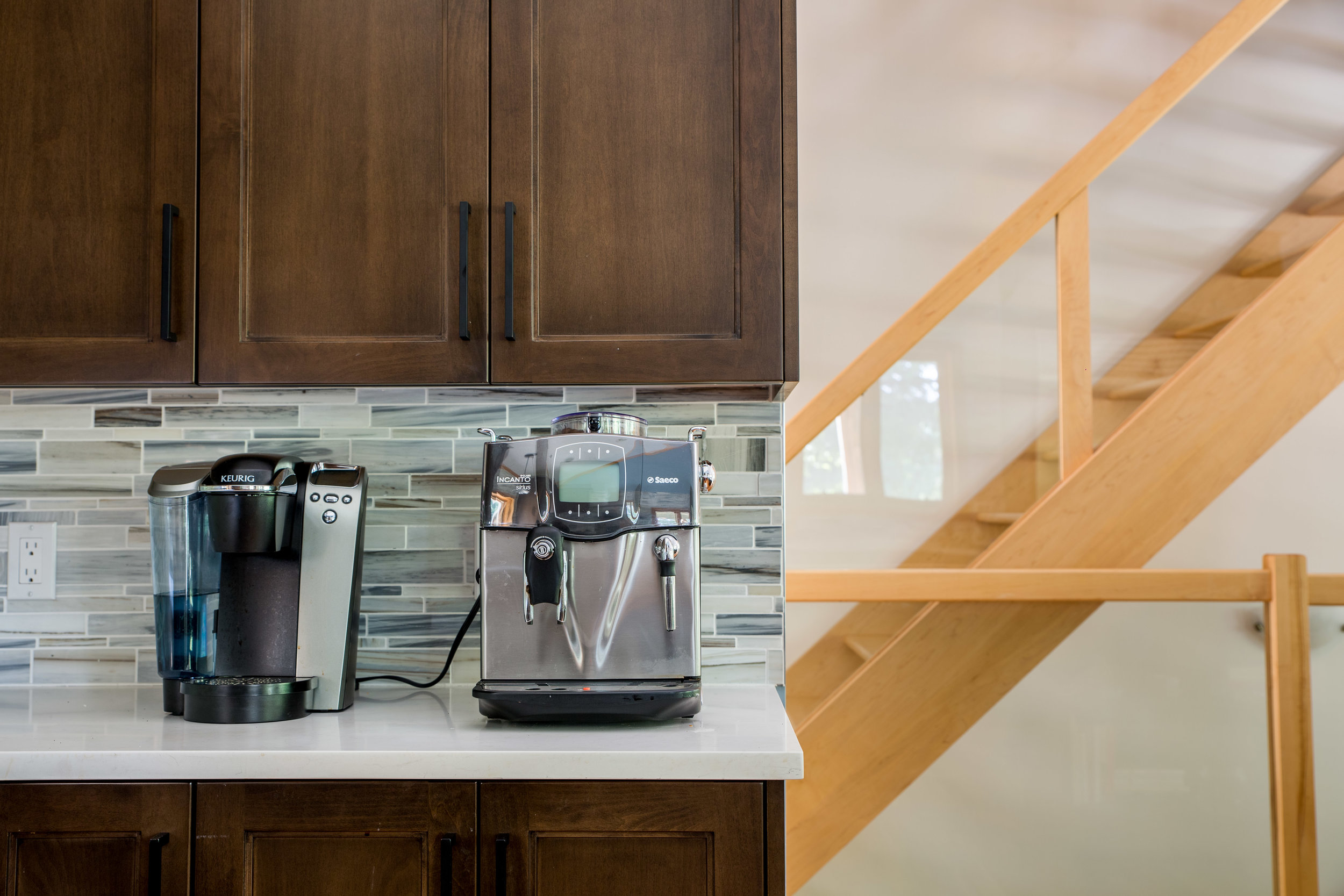
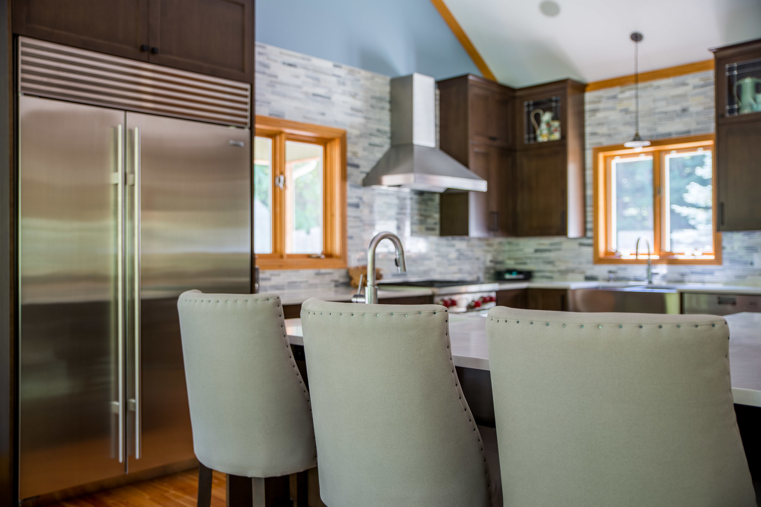
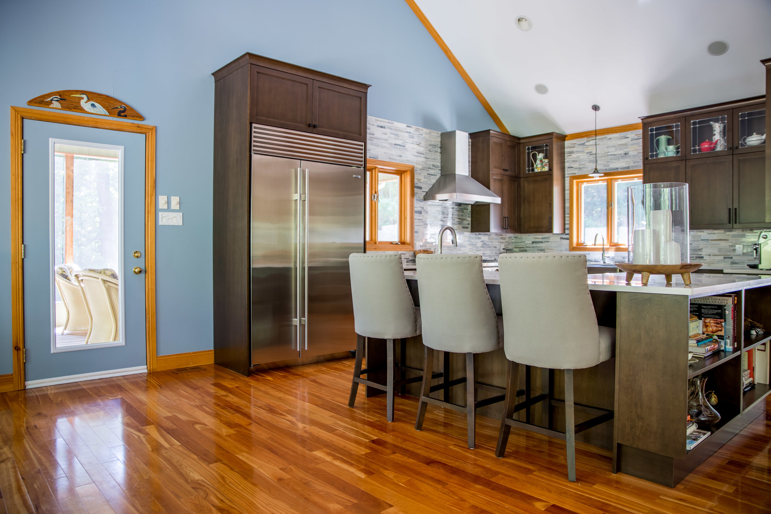
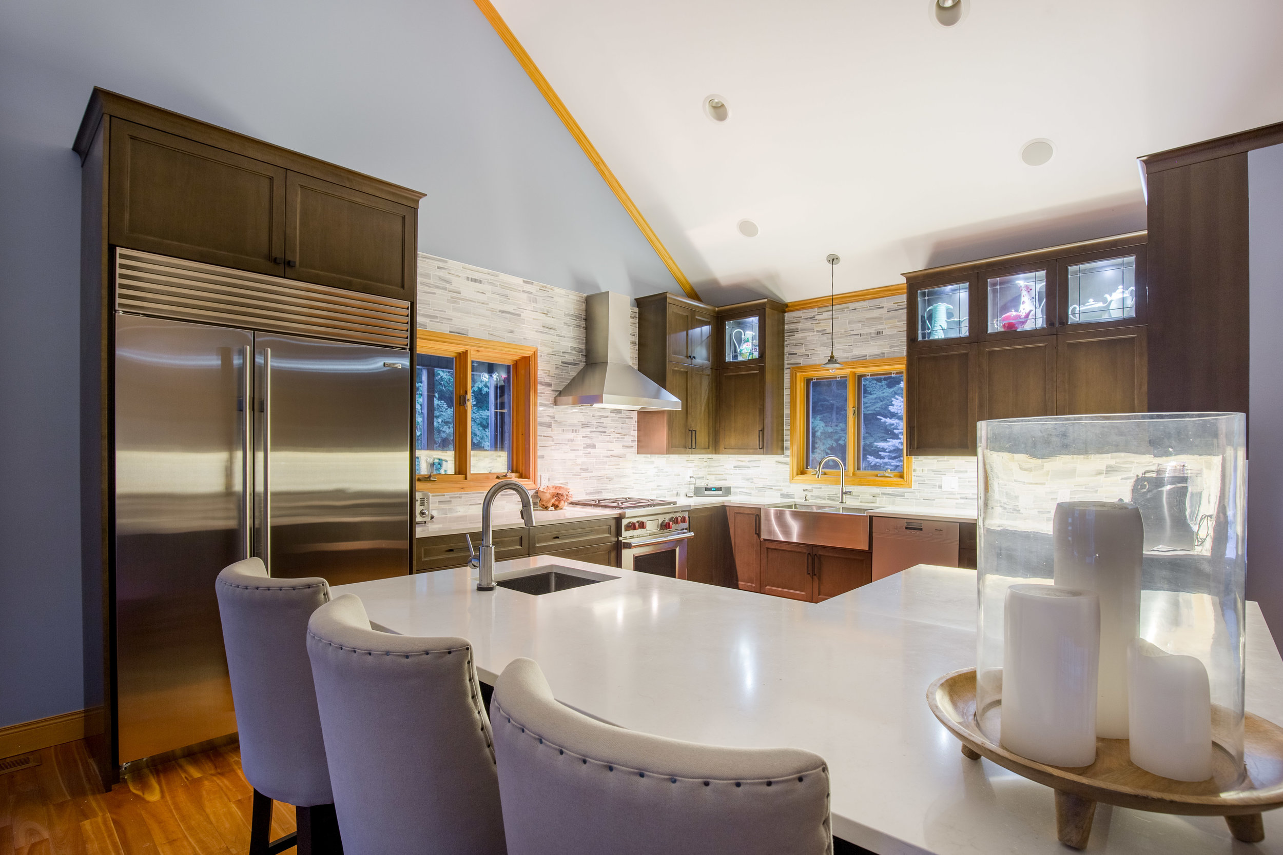
The overall layout of the kitchen was still very functional, so the main sink, dishwasher, fridge, and range all remained in the same locations, but improvements were made to each. We increased the sink size, and I chose to go with an apron sink in a stainless steel finish to continue that design concept of country chic. The dishwasher also got the stainless steel finish and I chose not to cover it with a cabinetry panel because I wanted the design to still feel simple and casual. Plus this new fancy Miele dishwasher was so quiet! The fridge was upgraded to a Sub Zero model that was almost twice as big as the original fridge was. Because our water supply comes from a well (and we hate the taste of it), we added a water dispenser with a filtration system. But to keep the stainless steel front looking clean and simple, I opted to put the water dispenser on the inside of the fridge. The range was also updated to a Wolf model with its fancy red nobs and blue interior, it just went with the décor so well it’s like it was meant to be! We also added a hood fan to the kitchen, which was something we didn’t have in the original design but my mom desperately wanted. The microwave was the biggest change, since we moved it into the island below the counter. And the model that I chose is a drawer, which allows larger platters to go in since there’s no spinning tray inside. And because it’s a tray, it allows for easy access to take things in and out of the microwave.

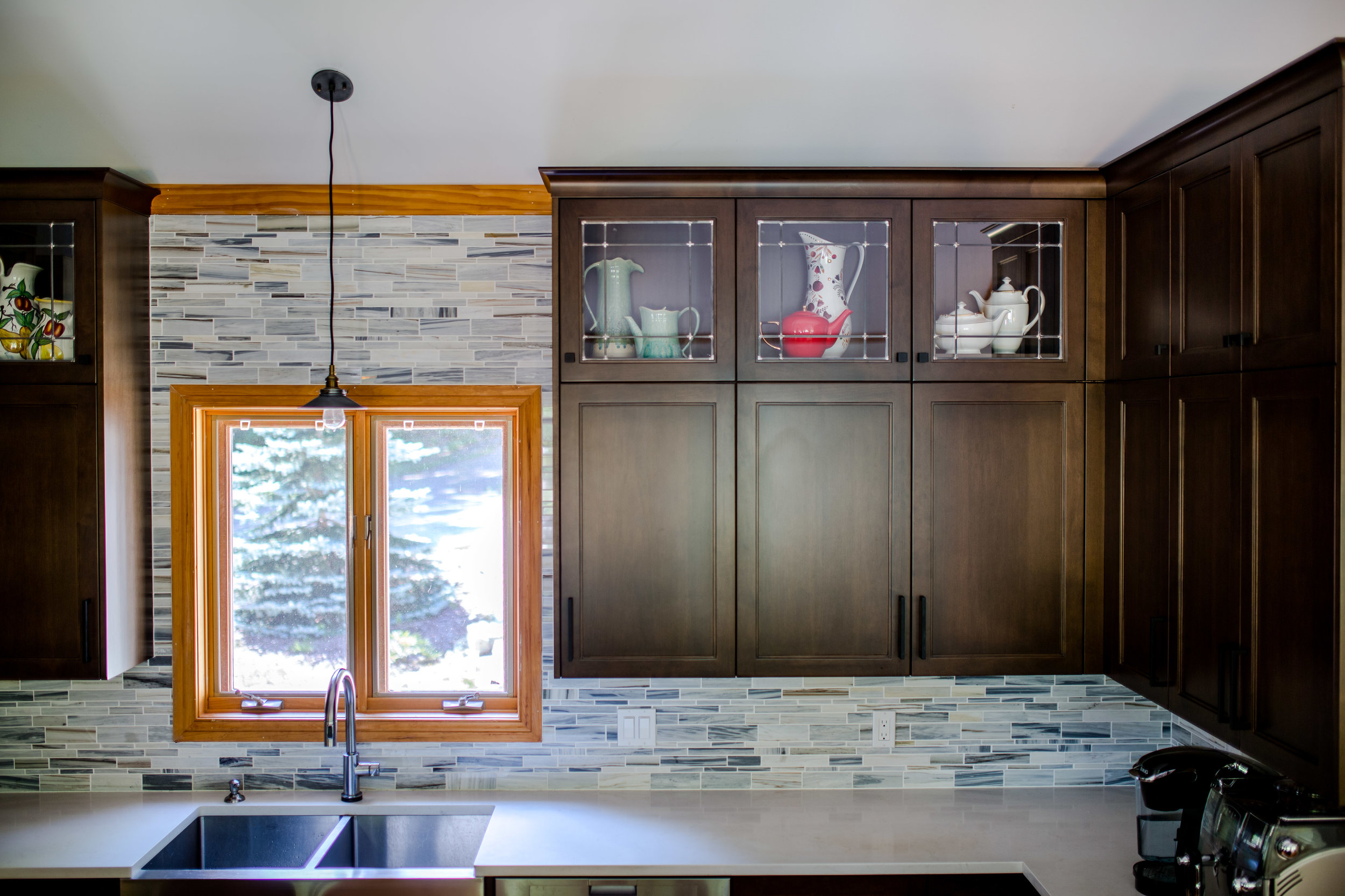
The aesthetic of the new kitchen design is by far my favourite part, especially the stacked upper cabinets. When I designed this kitchen, I had never seen stacked upper cabinets before, but now this trend has really taken off and it’s so gorgeous. It was the perfect installation for this particular kitchen since the ceilings are so high, and they really allow us to take full advantage of that height. To make those cabinets extra special, I added glass to the front of the main row of cabinets, then I filled them with large jugs and teapots to add more colour and usable artwork that suited the kitchen perfectly. The colour pallet for the kitchen design was very simple, with white counter tops and dark chocolaty wood cabinets. Because the floors throughout the house are light toned natural wood, I wanted the cabinetry to contrast the floor which is why I picked out some of the darker hues in the floor and used it as a jumping off point for the cabinetry colour. The last thing I wanted was for this beautiful kitchen to blend right into the floors. I went with white stone counter tops from Caesar Stone with a slight veining to it to keep the kitchen light and airy. To tie the whole design into the rest of the house I chose a beautiful blue marble stone tile in a random pattern. The blue helped relate the kitchen to the blue stone on the fireplace in the living room. I also wanted to anchor the space because of the high cathedral ceilings, so I followed the line of the lower ceiling and the top of the cabinetry and carried that line all the way around the kitchen carrying the tile all the way up the wall. To me this is seriously what kitchen dreams are made of, from the functionality to the aesthetics of the entire thing.
allison has always been in love with interior design. from an early age she has been fascinated with the impact that design has on our everyday living environment, and has the rare ability to walk into a space and visualize it at its full potential. allison believes that interior design is an art form that takes the ordinary to extraordinary, and strives to achieve practical solutions that are both beautiful and elegant.